
Having understood the added value of a graphical abstract (GA), explained in Part 1 of our “Show, don’t tell” series, the next step is to define how it should be designed and how it can best be used.
It is advisable to spend enough time on design, composition and visual appearance to highlight the most important findings. Authors should also consider the context in which the graphical abstract will be seen. It is important to put yourself into the shoes of your readers to better imagine what could spark their interest and what they would like to know.
Start by imagining what would attract your own attention.
Best practice tips
To make a good graphical abstract, consult the instructions of your target journal.
Then consider the following:
- Know your target audience
- Craft your story: include all important elements from hypothesis to results
- Use key phrases and keywords
- Select the appropriate graphic tool to create
- Use principles of good design (basic knowledge of fonts, colors, layouts, and design patterns as well as effective images)
- Pay attention to image quality in terms of pixels
- Keep the design crisp and easy to understand
The instructions for designing a graphical abstract vary from one journal to another. For instance, for the Cell magazine, the dimensions of graphical abstract images should be 1200 x 1200 pixels with a resolution of 300 dpi.
To craft your story start with writing down key findings and processes. Then, identify your main message and condense the research down into four or five sentences always having your target audience in mind.
Now, sketch out a draft of what the final abstract could look like. Depending on the information you want to convey and the kind of research done, this could be a variety of formats: e.g. a flow chart, a diagram of a process or a series of panels illustrating key aspects of the research.
Select a graphic tool and start designing. Choose a color palette and stick to it. Ideally, choose one or two main colors and use shades of these colors across the illustration. Make sure to use the same font throughout, but use it in different sizes and styles (e.g. bold, italic, light) to break it up and to highlight the most important parts. Leave enough white space to make key elements stand out.
If you want to find out more about the principles of good design, have a read of Picturing Science: Design Patterns in Graphical Abstracts from Jessica Hullman and Benjamin Bach.1
Always keep in mind that the image will create a reader’s first impression on the publication.
MIND THE GRAPH and BIORENDER – great tools to create compelling graphical abstracts
Mind the Graph is an easy to use, comprehensive online graphic tool that is specifically designed to cater for the design needs of the scientific community, including the medical community. It provides 6,000 scientific illustrations and a plethora of ready-to-use template layouts for infographics and graphical abstracts.
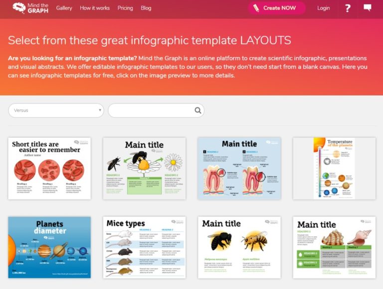
Screenshot of template section of Mind the Graph (Source: https://mindthegraph.com/templates/1/)
If you want to try it out, free access allows you to create up to five scientific illustrations with one photo upload each. The free version allows you to download your creation with a resolution of 72dpi.
The monthly subscription fee for individuals/academic researchers is only $12.95 per month and gives you full access and support.
Once signed-in, there are several categories to choose from which help to get you started: ‘main image’, ‘versus’, ‘diagram’, ‘process’, ‘timeline’, ‘facts & figures’, and ‘cycle’.
All are freely editable and adaptable. You can choose from a database of icons, elements, and images or upload your own images and start creating compelling visual content yourself without having to hire a graphic designer.
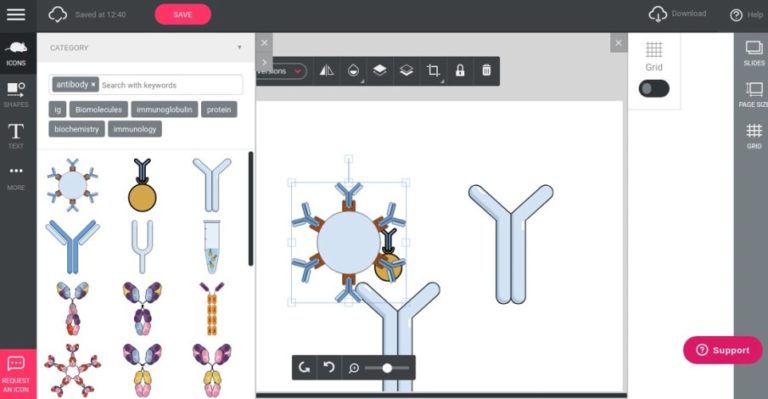
Screenshot of workspace: Antibody icons from Mind the Graph icon library
Another great versatile tool to create scientific illustrations is BioRender.
Its ibrary of icons and templates features about 20,000 icons from neuroscience, immunology and microbiology, and covers more than 30 areas of life science. Users can even request new icons if they cannot find what they need, and BioRender will create them in as little as 48 hours.
BioRender offers drag-and-drop functionality and pre-set colors based on scientific conventions and of course the possibility to export to multiple formats for publications, presentations, web or print.
It is free to try out for educational purposes with some feature limitations. Monthly subscription with full functionality and permission to use the figures in publications is $35 per month for an individual user.
Screenshot of icon library of BioRender (Source: https://biorender.com/library/)
Besides many other online tools that are suited for the creation of GAs (e.g. Canva, Snappa and Piktochart) you can also use regular design software (e.g. Adobe InDesign, Microsoft Publisher and CorelDraw). There are many more out there, so have a browse and find the one that works best for you.
How to use graphical abstracts to promote your research
Graphical abstracts are easily shareable online and make the perfect asset to promote your research online. They can be used on social media (Twitter, Facebook, Instagram, LinkedIn and YouTube). Research has shown that promoting a paper with a graphical abstract does lead to more article visits.2
See examples of GAs in tweets below.
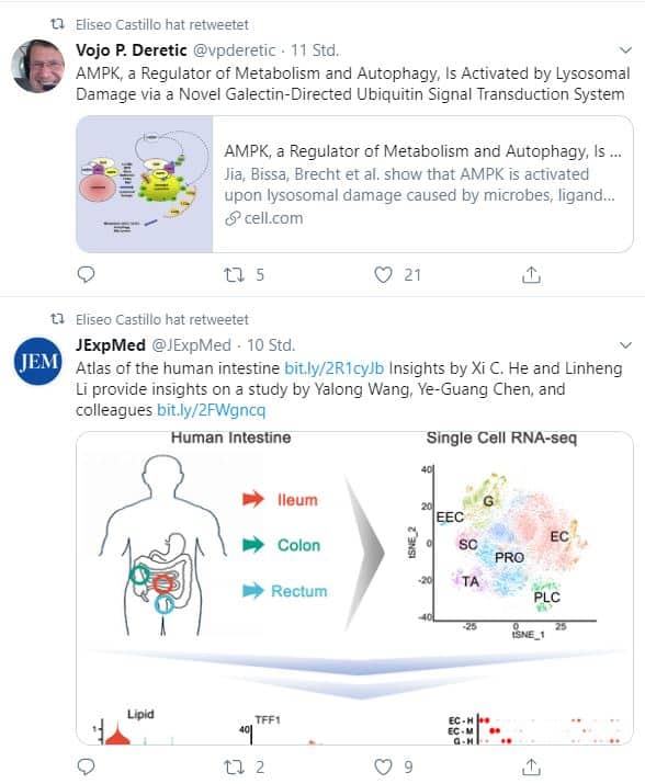
Screenshot of example of graphical abstracts being promoted through social media (tweet 28. January 2020, @eliseo_fc)
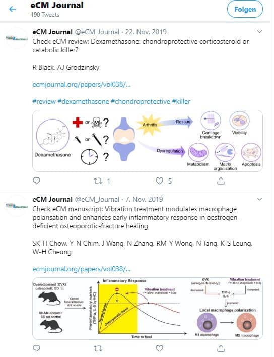
Screenshot of example of graphical abstracts being used in social media (tweet from @eCM_Journal)
Graphical abstracts are perfect for including on your research or institutional website. They are powerful attention-grabbers not just for social media announcements but also in media releases or grant applications. It is easy to repurpose their visual elements to support your lectures, professional talks or poster creations.
Outlook
If scientific authors want to succeed today and in the future, they’ll need to adapt their communication practice to the fast-evolving media landscape, and think online first, including social media.
It also means that the promotion of research should be made an integral part of their publication process and routine. This will ensure optimal dissemination of findings and results, and help to increase visibility in a very crowded scientific content space.
Experts like medtextpert cannot only help you get your results published in a timely manner. We can also support you in the creation of eye-catching scientific visuals and, most importantly, in promoting your findings.
We make sure that endless hours and years of research effort won’t go unnoticed.
References
- Hullman J, Bach, B. Picturing Science: Design Patterns in Graphical Abstracts. In: Chapman P, Stapleton G, Moktefi A, Perez-Kriz S, Bellucci F (eds) Diagrammatic Representation and Inference. Diagrams 2018. Lecture Notes in Computer Science, vol. 10871. Springer, Cham. 2018: 183-200. Available from https://link.springer.com/chapter/10.1007/978-3-319-91376-6_19
- Ibrahim AM, Andrew M. Lillemoe KD, Klingensmith ME, Dimick JB. Visual Abstracts to Disseminate Research on Social Media. A Prospective, Case-control Crossover Study. Annals of Surgery. 2017; 266(16):e46-e48.