
Most of us love visually appealing infographics. But what are they? According to the Oxford English Dictionary, an infographic (or information graphic) is “a visual representation of information or data”. As the name suggests, they combine information and graphics to increase understandability at a glance.
In today’s fast-paced information landscape, providing visually attractive content is the key to reaching out and engaging with audiences. Infographics are a great visual communication element , as long as they are executed well and put in context. They help to make complex information and topics easy to grasp and digest, to enhance comprehension, and to increase information recall.
If you wanted an infographic a few years ago, you would have had to go to a graphic designer or a design agency. Now, with plenty of new applications online at little or no cost, you can create a compelling infographic on just about any topic yourself.
In this post, we’ll review some great online tools that are especially suitable for the creation of infographics. We have also prepared a list of 10 essential tips that will support you in the design process and help to sharpen your focus so that your infographic has the desired outcome.
But first, let’s explore the important difference between data visualization and visual storytelling.
Data Visualization vs Visual Storytelling
When we think about visual communication it is important to keep in mind that there are two basic types of visual communication: information or data visualization, and visual storytelling.
Information or data visualization helps to break down complex data or processes into clear and easy-to-understand visual chunks that help readers comprehend and therefore retain data better. The audience is encouraged to come to their own objective conclusion.
Examples of data visualization elements include graphs, charts/maps (static or interactive), or diagrams, such as those below:

Visual storytelling uses a combination of visual elements (icons, illustrations, charts, colors, fonts and white space), facts and text to craft a story that guides the viewer to a conclusion based on an introductory statement or a subjective narrative.
Formats used for visual storytelling include infographics, whiteboard animations, quirky gifs and videos.
In summary, therefore, great infographics employ a story-first approach that is data-driven. Keep this in mind during the planning process!
Now it’s time to give it a go, so let’s have a look at some tips to help you get started.
10 TIPS for creating effective infographics
- Define and picture your target audience.
- Plan the infographic on a specific topic that is relevant to your target audience.
- Craft your story carefully and prepare a simple brief.
- Keep it straightforward and focused.
- Select the right design tool for your needs and skill level, or work with a design professional.
- Pay attention to good design:
- Ensure a good balance of visual and written information.
- Employ a text hierarchy for headings, subheadings, and body text. Use a maximum of three fonts.
- Guide your readers’ attention using only one or two contrasting colors and their respective gradients.
- Pay attention to image quality and readability. Be mindful of text size and include ample white space.
- Create a killer headline.
- Focus on the flow.
- Cite references.
- Promote!
THE INFOGRAPHIC TOOLKIT for novices and experts alike
Whether you have great design skills or not, the following online tools will allow you to make infographics in under 30 minutes – no graphic designer needed. We have selected options that are either free to use or that come with affordable monthly subscription options.
CANVA
- Price:free and paid options
- Paid access:
- Freemium purchases: you can customize your designs and purchase premium templates, icons, images and more.
- Canva Pro is suitable for small- to medium-sized operations. It starts at $12.95 per member per month.
- There is also Canva for Education and for Nonprofits, which gives eligible users free access to all Canva for Work features.
- Canva Enterprise offers companies with larger teams their complete toolkit with additional options. Pricing on demand.
- Personal highlight: The free plan will cover most of your design needs.
- Quick learning resource: YouTube
Canva is my preferred site for infographics, and a powerful online design tool that caters for almost all visual content needs of a medical content creator, even without any design knowledge.
It offers a huge (more than 50,000) range of templates for business and personal needs alike, including templates for use in medical visuals (brochures, cards and presentations) or infographics (whether relating to education, process, business, timeline or charity).
Canva offers a vast library of searchable elements, photos and backgrounds (some free and some for purchase), which can be included via a drag and drop editor. Canva claims to provide access to over 1,000,000 images, taking advantage of APIs from free stock photo websites like Unsplash to enrich its image library. You can also upload your own elements and add them to your project.
For infographics, you can start with a blank canvas or choose from a variety of templates, all completely customizable.
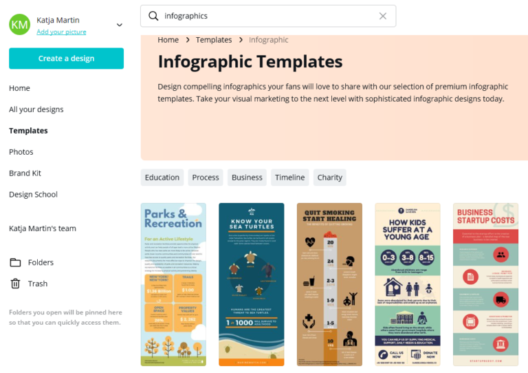
Source: Screenshot of Canva’s infographic templates
Canva allows you to download the visual you have created in either PDF or PNG/JPG formats. An infographic will be downloaded in 800×1200 resolution if you are on a free account.
VISME
- Price: free and paid options
- Paid access:
- Freemium: restricted to three projects per month; Visme logo on all downloads
- Standard: $19 per month
- Complete: $39 month
- Team: $117 per month for up to three users
- Enterprise: price available on request
- Personal highlight: Visme offers options to make your infographic interactive with links, integration of animation, and pop-ups.
- Quick learning resource: YouTube
Visme is another powerful, all-in-one visual communication tool especially suitable for marketers, as it allows them to create, for example, presentations, animations, banners and of course, infographics.
With over 500 templates to choose from, Visme is the go-to infographic tool for the occasional designer. As with Canva, you can add elements such as shapes, images and icons to your project and customize them freely. Visme also takes advantage of the free stock photo website API Unsplash to increase its image options.
A site that is similar to Visme is Venngage.
VENNGAGE
- Price: free and paid options; free for students
- Paid access:
- Premium for individuals starts at $19 per month
- Business starts at $49 per month
- Education (35 accounts per class): $29 per month
- Nonprofits receive 50% off all plans
- Personal highlight: The design inspiration gallery is updated almost daily.
- Quick learning resource: YouTube
Venngage offers a variety of templates (over 100) for things like reports, posters, promotions, and infographics.
The great thing about Venngage is that it organizes its infographic layouts into categories: Statistical, Informational, Process, Comparison, Timeline, Geographic, Charts and Tutorial.
PICTOCHART
- Price: free and paid options; free for students
- Paid access:
- Lite: Premium for individuals starts at $19 per month
- Business starts at $24.17 per month
- Education and nonprofits: $39.99 per year for individuals and $79.98 onwards for team plans
- Personal highlight: Works in blocks. You can edit (copy/paste, add) whole blocks.
- Quick learning resource: YouTube
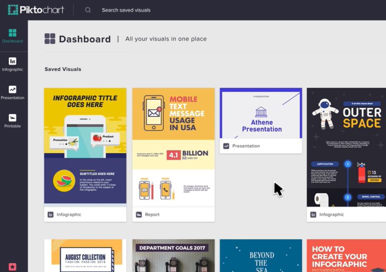
Piktochart is another valuable online design editor to help you generate eye-catching, informative infographics. Formats vary from traditional infographic size – tall and skinny – to presentation size, to poster and report formats.
Last but not least, another simple but useful resource: Easel.ly.
EASEL.LY
- Price: free and paid options.
- Paid access:
- Freemium: allows downloads in jpg format with a resolution of 684×839
- Business: starts at $5 per month
- Enterprise: pricing on demand
- Education: students $2 per month, teachers $4 per month
- Nonprofits: $5 per year
- Personal highlight: Free design sandbox (test it without registering)
- Quick learning resource: YouTube
Like the other tools, Easel.ly makes it easy to create infographics just by using one of the templates from its searchable template library. Easel.ly offers a top bar menu, just like a conventional desktop app.
Easel.ly claims to have generated more than 6,000,000 infographics. The paid option gives you access to 681,982 images and 732 high-quality templates.
All online graphic design tools come with tutorials on their websites, blogs or YouTube channels. You can also find great course material at very affordable prices on Udemy, e.g. https://www.udemy.com/course/how-to-create-professional-infographics-to-attract-visitors/
If you are more advanced and want to create your own illustrations from scratch, there are also plenty of easy-to-use free graphic design tools to choose from, such as Krita, Gravit Designer and GIMP.
Now that we’ve got our toolkit, let’s explore how infographics could come in handy in healthcare settings.
Infographics applied in healthcare
In addition to presenting scientific research and data, infographics can be used in many healthcare scenarios. They have great potential in all processes that involve education: education of patients, students and medical staff. Here are a few examples:
Patient information and education – disease, disease management, behavior/prevention campaigns
Procedural explanations – entry and exit of a hospital, treatment procedures, post-treatment algorithms, rehabilitation schemes, medication adherence, etc.
Educational materials for care settings – students, nurses, physicians, pharmacists, physical therapists, etc.
Industry information – explaining products, procedures, instructions and directions for medtech, pharma or lab settings
Further applications – patient organizations, non-profits, health insurance
Examples of well-designed healthcare infographics
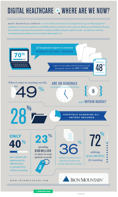
Screenshot of Iron Mountain’s “Digital Healthcare + Where are we now?” (Source)
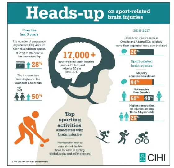
Screenshot of CIHI “Heads-up” Infographic (Source)
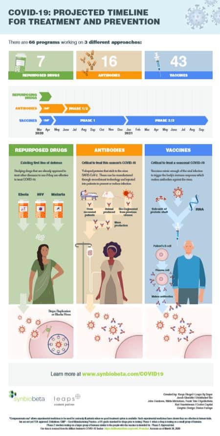
Screenshot of Synbiobeta‘s infographic to projected timeline to treatment and prevention of COVID-19 – find the downloadable pdf here.
Don't forget to promote
Study after study has proven the power of visual storytelling, but even the most compelling visuals are redundant if nobody sees them. Remember, therefore, that content promotion is as important as its creation.
Infographics do not automatically go viral. Once you have created your visual, be sure to choose the right strategy for distribution. Your plan may include sharing on your own website or social media channels, reaching out individually to your network by email, or even submitting your infographics to directories (such as visual.ly, Daily Infographic, Cool Infographics, Flickr, and Infographic journal).
Infographics are very versatile and effective visual communication elements that help establish online credibility. They can be repurposed across different digital (online) and print (offline) channels. They are also fun, and a satisfying respite for a mind overburdened with text.
So if you don’t currently use infographics, roll up your sleeves and start today with one of the easy-to-use online tools explored above. You will soon discover the vast possibilities visual communication with infographics has to offer.
Still not convinced? Give us a call. Medtextpert is here to help, no matter how minor your inquiry might seem. What’s more, we love infographics and have been benefiting from their application for some time.